DESIGN SYSTEM WORK
  Overview
While working on a design system team, I got the opportunity to design some individual components to be added to the ever-expanding design system. Some of this work involved making improvements to existing components and some I designed from scratch. Through this experience, I now know how to design components that look like they belong within the wider system.
Status Indicators
Status indicators allow you to quickly view the status/performance of different elements. They help highlight areas that require attention. A status indicator component already existed, however, they were inaccessible and lacked variants. I was given the responsibility of improving these.
  Process and challanges
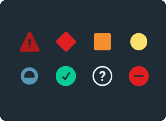
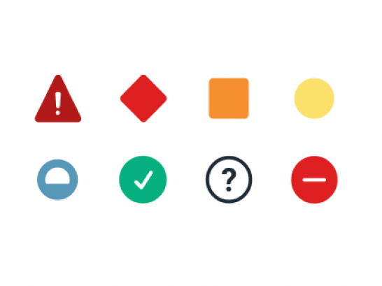
I did a lot of research into how to make our status indicators accessible. To meet the WCAG they had to include at 3/4 of the following elements: shape, symbols, colour and type. The first thing I did was design new symbols for each criticality level.

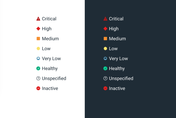
As we have 6 status indicators to distinguish between, it was difficult to decide the perfect symbols and colours to use for each. To overcome this, I organised many meetings with the wider team to discuss the many iterations. I also did research on how people relate certain colours to different statuses’. This same research and user testing was completed when determining the shapes too.

With a large design team, I got many requests to design different variations of the status indicators to fit their specific use case. If I designed a status indicator variant for every use case I was asked for, the component set would become too complex. This would risk creating inconsistency inside the product. To overcome this, I took everyone's requests into consideration and designed variations that would work for everyone. I also provided thorough documentation and guidance on how and when to use each variant.
  Final outcome
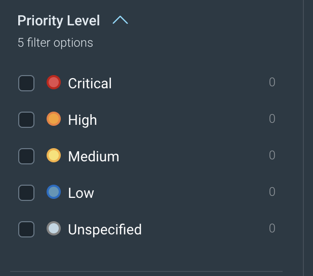
To meet accessibility standards, our new status indicators always include a label, unique icon and different colours. This means that if someone is colour blind, for example, they still have 2 other ways to differentiate between the different statuses. To meet our design teams’ use cases, we now have default, pilled, coloured, bold and subtle variants of status indicators. We also have nano, small, default and large sizes. Having this complete set means we don’t have to slowly add variants when people ask for them as they are already designed and ready to go.
Slider
A request came in for a new slider component and I was given the task of designing it. This was a component that didn’t already exist within our library so I had to design it from scratch.

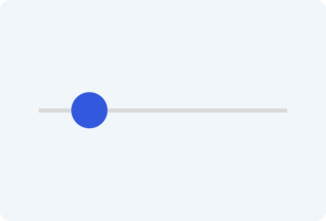
Sliders allow users to make selections from a range of values. For example, adjusting volume or brightness.
  Process and challanges
I started by researching how other design systems approached this component. I soon found that there are many different approaches and ways of designing this. This was overwhelming at first as I didn’t know what the “best” solution was.

In the end, we came to the decision to combine the different abilities into one component. This doesn’t mean that all of these abilities have to be used in every scenario, but rather, it gives designers the option to choose which of these features best suits their use case.

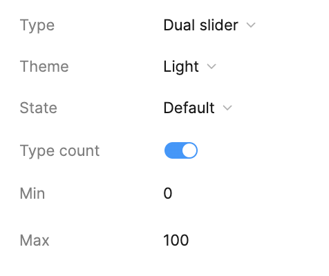
Doing this required a lot of work with Figma properties to give designers the ability to turn on and off features and customise the slider. Naming the properties is something I needed to think carefully about as they needed to be easy to understand.


Although I had a lot of creative freedom with this component, it still had to fit in with the rest of the company’s UI. This is something I struggled with when it came to the handle interaction. At first, on hover, I made the handle get bigger in size and change colour. I chose this for accessibility purposes as people with colour blindness or vision problems would be more likely to see the change in size rather than just the colour change. However, this interaction was not an existing pattern so it isn’t something users would expect to occur.

Instead, I chose to have a colour change on hover as this is a familiar pattern for our users. This didn’t cause an issue with accessibility as I thought it might. This is because the cursor change in addition to the change in colour was enough of an indication that the handle could be interacted with.
  Final outcome
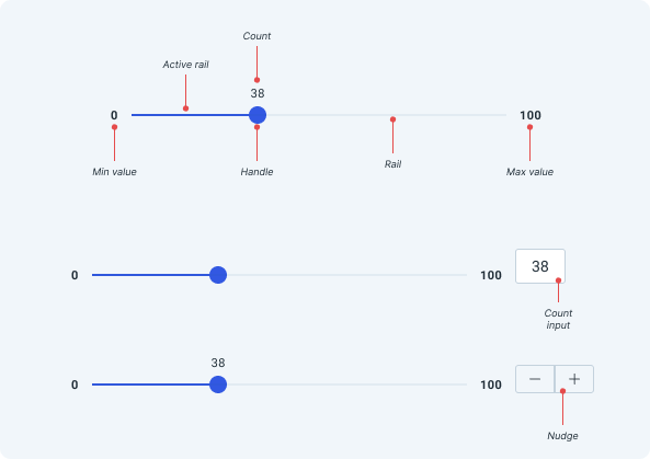
In the end we had four slider types. Our designers had the ability to show or not show the rail, include a count input, nudge the values and even have two numbers changing on the rail at once.

They can also remove the type count, input the number values from the side panel and of course switch seamlessly between light and dark mode. Putting in the time to include as many variations as possible will make our process easier in the long run. This is because we considered as many use cases as we could think of and therefore, will less likely be asked to design another version later on.